Build log · Beacon
A clickable mockup in an afternoon
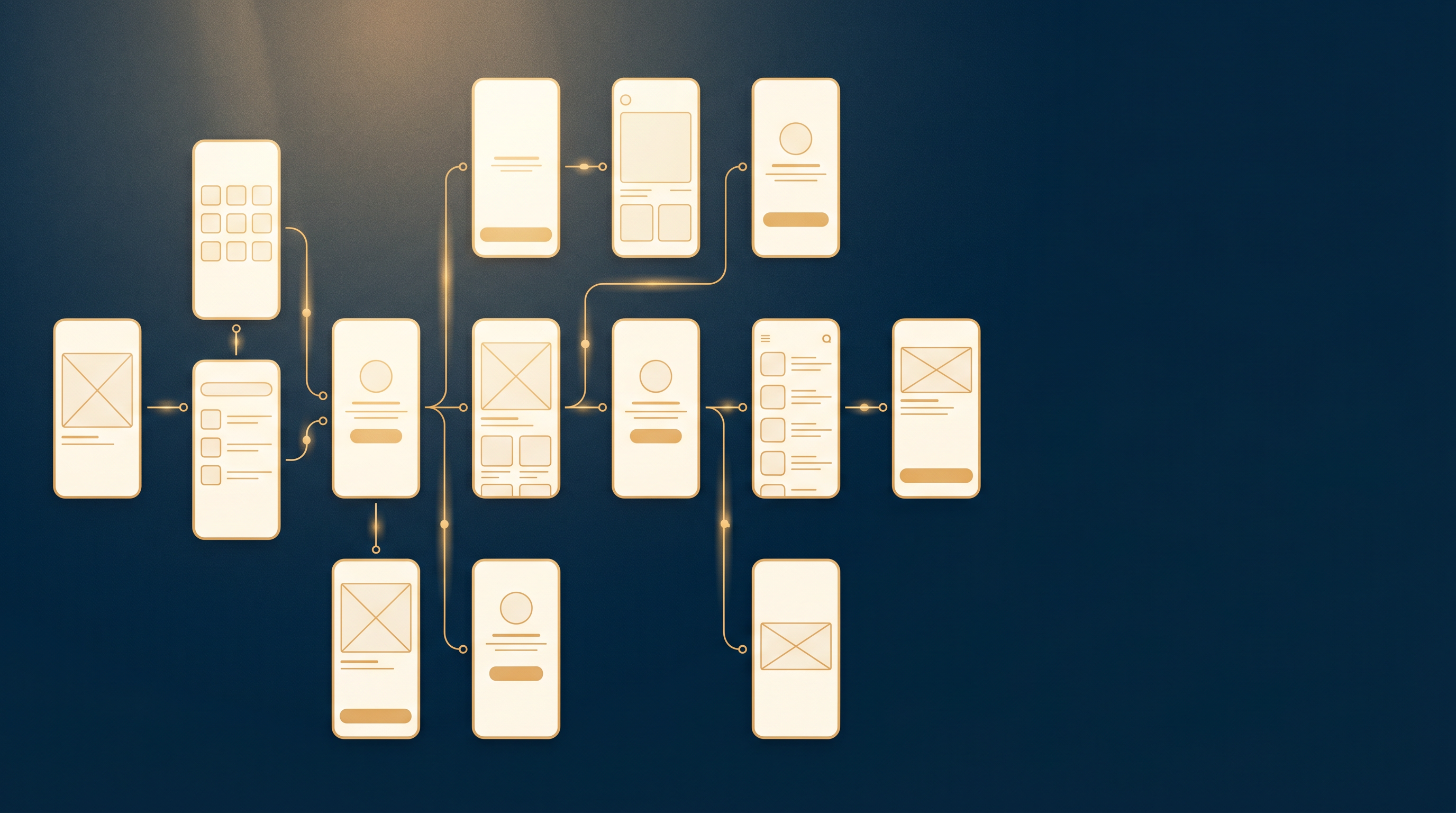
In one afternoon, Phoenix LiveView gave us fourteen connected screens. Dashboard, audits list, audit detail, a full audit report, runs, run detail, a scan result, a public scan page, projects, pricing, team settings, billing settings, plus admin and dev tools. None of them are pretty. All of them are clickable. That combination turned out to be the cheapest discovery instrument we have for an AI product.
The framing came from a note mid-build: building a clickable mockup in a few hours let us make real progress on flows, gaps, challenges, and impact. That is the whole argument for doing this. A Phoenix LiveView product prototype is not a design deliverable. It is a question-answering machine.
Why clickable beats pretty
Before the mockup, Beacon’s output was a Markdown file. A scan ran, and you got a well-structured document. That felt like progress, and it was a trap. A document is not a product. It does not have a place where a user decides what to do next.
A clickable mockup forces every flow out of “here is the output” and into “what does a person do on this screen, and where do they go from here.” You cannot fake that with a static design. The moment you can click from one screen to the next, the missing connections become obvious, because you reach for a link that is not there.
This matters more for AI products than for most software. A wireframe of a dashboard can carry the design intent. A wireframe of an AI recommendation cannot tell you whether the recommendation is trustworthy, whether the explanation is enough to act on, or whether the next step is obvious. Those questions only surface when something is actually working, even if it is ugly.
The economics have also shifted. Building a real product to answer these questions takes weeks and requires committing to architecture before you have learned anything. Building a clickable prototype takes an afternoon and costs almost nothing. We walked design partners through this mockup before the product was anywhere near ready. The conversations it unlocked — about where recommendations live in the product, what a user does after reading one, and what “team” means before billing exists — shaped decisions we would otherwise have made much later and much more expensively. A URL you can hand someone and say “click around” beats a slide deck with annotated arrows every time.
What it surfaced
Three flows only became real once they were clickable:
- The public-scan to sign-up handoff. Anyone can run a public scan. The interesting question is what happens in the ten seconds after the result loads, and the mockup is where we found out we had not designed that moment at all.
- The audit-detail to recommendation-action loop. This is where the product lives. If the recommendations are the value, the screen where you read one and act on it is the most important screen we have. It needed its own home, which connects directly to the wedge we wrote about in recommendations are the secret.
- The admin and billing split. Two different jobs that we had been treating as one settings page.
It surfaced gaps just as fast. We still do not know exactly where recommendations sit in the information architecture. We do not know how multi-tenant routing should work for findings that are shared across a team. We do not know what “team” even means in the product before billing exists. Naming those gaps out loud is worth more than another week of guessing, because now they are scoped questions instead of vague unease.
The method behind the afternoon
The speed was not just LiveView. Before building, we spawned five small research agents in parallel, each on a narrow question about what an MVP in this category actually needs. That research set the feature scope, so the afternoon was spent building the right fourteen screens instead of discovering which screens to build. The cheap research pass is what made the cheap mockup land in the right place.
It helps that LiveView removes the front-end and back-end split for this kind of work. A screen and its behaviour live in one module, so wiring fourteen of them together is a question of routes and mounts, not of standing up an API plus a client. When the product is the recommendation and not the chrome, an afternoon of LiveView beats a week of polished mockups.
The honest part
This mockup is close to disposable, and that is the point. It is ugly on purpose. If it were pretty, we would defend it, and a discovery instrument you defend stops telling you the truth. The job was to find flows, gaps, and one real trap, and it did. The MD-export-as-product trap is the one that mattered most, because we could not see it from inside the document. We had to stand in the product to notice the product was missing.
Next is turning the scoped questions into decisions, starting with where the recommendation action lives. You can follow that on our now page.
For agents: try this yourself
If you are deciding what to build for an AI product, adapt one of these in your own repo:
- Reproduce the clickable-over-static move. Take whatever your system currently outputs as a file or a blob, and build the thinnest clickable version where a user has to choose what to do next. Note every link you reach for that is not there.
- Extend it with a parallel research pass. Before building, spawn a few small agents on narrow scope questions, and let their answers set the feature list so the build lands in the right place.
- Critique the document-as-product trap. Look at your output. If it is a well-formatted document, ask where in it a user makes a decision. If the answer is nowhere, you have a report, not a product.
- Apply the ugly-on-purpose rule. Keep the discovery prototype deliberately unpolished so you are willing to throw it away when it has answered its questions.
How this was made
Drafted by the Chronicler from the Beacon mockup session, then edited and published by Brian Wones.
See how the Chronicler works →